Build Connectivity Quickly.


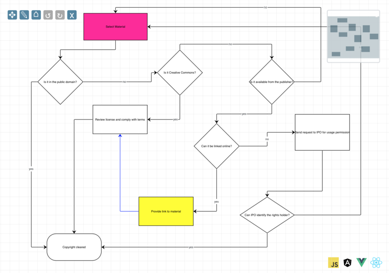
Flowcharts
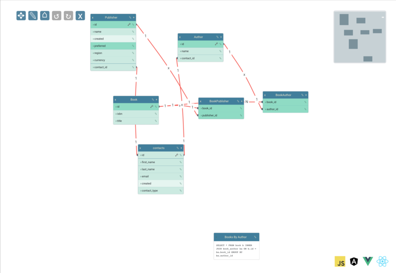
Schemas
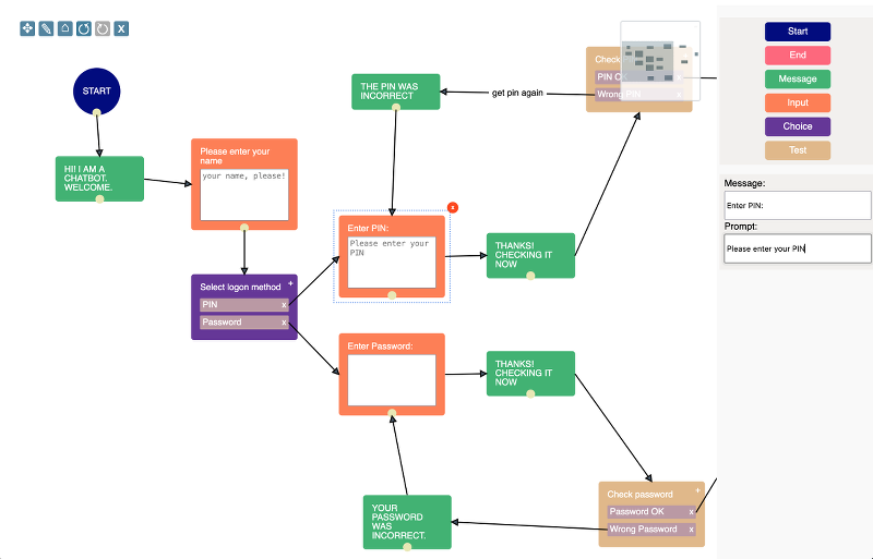
Chatbots
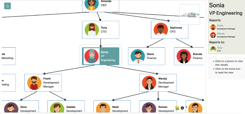
Org Charts
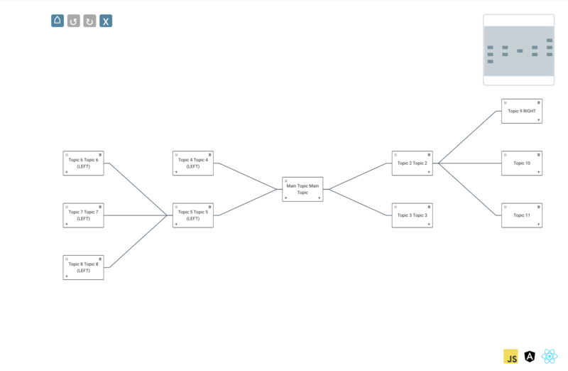
Mindmaps
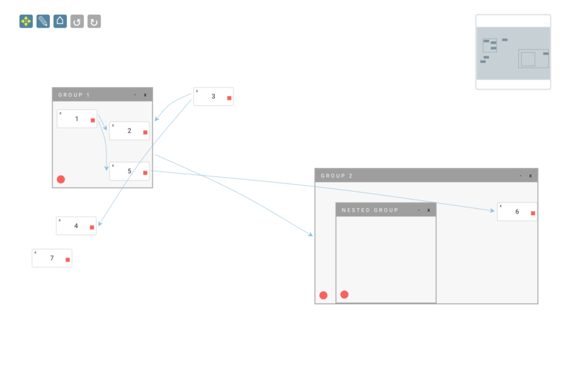
Nested Groups
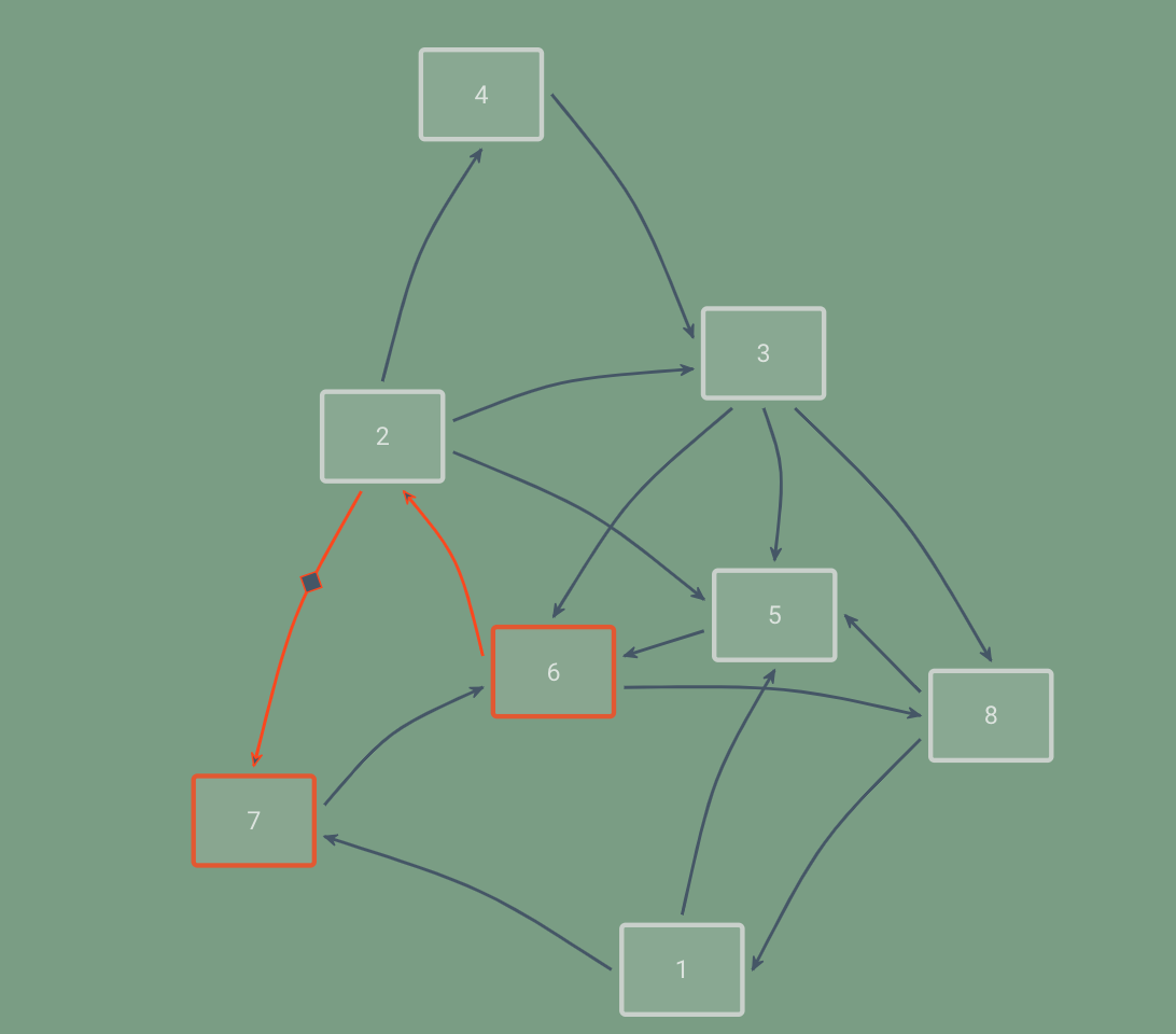
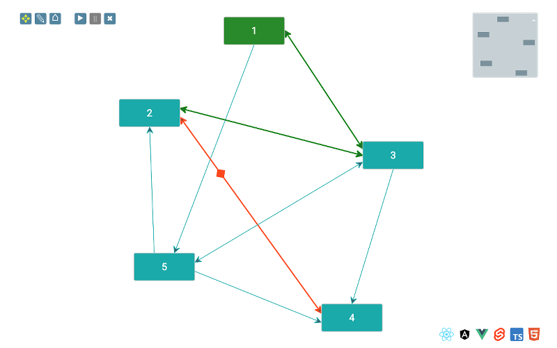
Path Tracing
Hello World
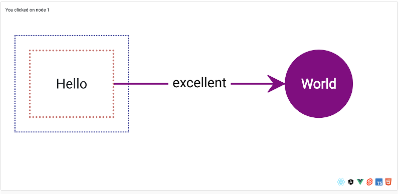
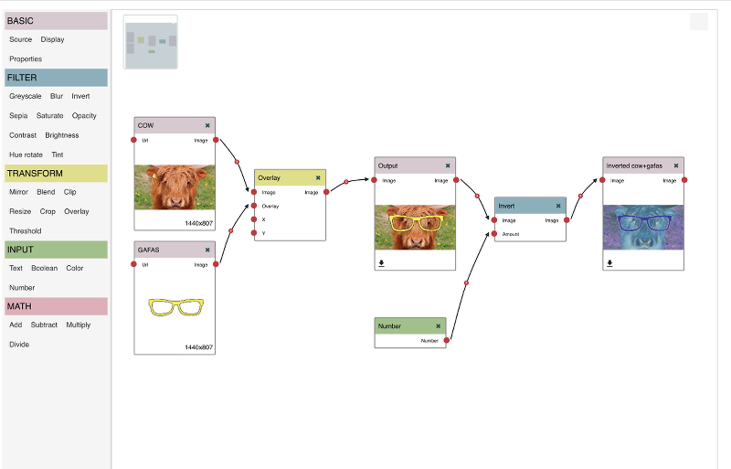
Image Processor Pipeline
Extensive built-in feature set
Layouts
The Toolkit provides a number of built-in layouts - Force Directed, Hierarchy (org chart), Balloon and more - and it's a straightforward process to write your own.
Miniview
Use the miniview to help navigate your way around the UI. Zoom in and out via the miniview, even with touch events.
Undo/redo
All operations on the dataset can be easily undone/redone, and the Toolkit provides support for batching operations in transactions
Pan/zoom
The smoothest wheel zoom for miles around. Touch events are handled transparently with no need for an external library. Pan and zoom operations are automatically clamped to ensure your users never lose track of where they are.
Templating
The Toolkit has a clear separation between model and view, allowing you to define templates for your nodes and groups and leave it to the Toolkit to know what to render
Library Integrations
The deepest library integrations of any diagramming library (because jsPlumb is not just a diagramming library!) - use components from React, Angular, Vue or Svelte to render rich graphical content and isolate behaviour
Drawing tools
Resize elements using the mouse or touch devices. Fully customizable via CSS.
Shape Libraries
The Toolkit ships with a set of SVG shapes for drawing flowcharts and a simple means for plugging these in to your UI. Watch this space - we'll be shipping BPMN shapes very soon!
CSS styling
Every part of the Toolkit UI publishes an extensive list of CSS classes that you can use to tweak the appearance.
Edge editing
Let your users find their own paths with the Toolkit's edge editor functionality.
Graph operations
Use the Graph that lies at the heart of the Toolkit to query the dataset. What's connected to this vertex? What are the ancestors of this group? Is there a path from this vertex to some other vertex?
Path tracing
Grab a path from some vertex to another and then have the Toolkit navigate an overlay along it
 React
ReactCreate your UI using rich components in your library of choice.
Do you have a library you'd like us to integrate with? Get in touch and let us know!
The jsPlumb Toolkit supports all modern desktop and mobile browsers, with full touch event support and pinch to zoom on touch devices. No external library needed.


