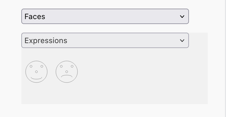
In this release we've made a small tweak to the way we render custom overlays which supports automatically updating
their orientation based upon the endpoints of their edge. Let's say we want to put this SVG at each end of our edges:
Since we want this at the start and at the end we'll write a factory to create a spec for a custom overlay:
This adds a nice new capability to the Toolkit, and we're looking forward to seeing what you do with it. It also links
nicely with a concept that we're preparing to introduce in 7.x - that of markers. These will be the natural evolution
of overlays, and over the next few months we'll be sharing more information about what they are, how to use them, and why we
think they're the future.
If you'd like to discuss any of the ideas/concepts in this article we'd love to hear from you - drop us a line at hello@jsplumbtoolkit.com.
Not a user of the jsPlumb Toolkit but thinking of checking it out? Head over to https://jsplumbtoolkit.com/trial. It's a good time to get started with jsPlumb.
The jsPlumb Toolkit uses individual SVG elements to render edges and individual SVG/HTML elements to render nodes, which is a different approach to other libraries in this space. In this post we're going to discuss the reasons why we do this, give a little historical background, and also share our vision for the near future.
jsPlumb does not use a single SVG context element because we do not consider jsPlumb to be limited to being strictly a diagramming library. jsPlumb's approach to rendering - allowing you to use any HTML or SVG to render your nodes - means that it is capable of building a whole other class of applications that many other libraries in this space cannot, or at least not in a straightforward and maintainable way.
The original Community edition of jsPlumb, before it was even known as the Community edition, was released in 2009, at a time when the browser landscape was markedly different from what it is now. Our first release used an HTML canvas for each edge, inspired by the majestic Yahoo Pipes application, beloved of Ajaxians everywhere. But we wanted to support IE6, because it still had a large market share, and IE6 had no canvas or SVG support. What it did have, though, was VML. VML elements behave in a page like canvas elements do: there is no notion of a top level container to group them all, like you can have with SVG.
Since our renderer needed to be written in such a way that the knowledge of canvas vs VML vs SVG was the very last consideration, we standardised on the approach of a separate element for each edge, positioned individually.
In this little snippet we've painted an outline on each edge's SVG element. As you drag the nodes around you can see the way the SVG elements are resized and repositioned:
Do you notice how the node you are dragging turns green and is always positioned above the other nodes in the display? That's because of this CSS rule:
We render all of our nodes with the .jtk-show-outline-demo class. When a user starts to drag a node, the Toolkit assigns the .jtk-drag class, and removes it on drag stop. For us it means that with a simple CSS rule we can implement a useful piece of UX.
This is not easily done when rendering to a single SVG context element. If you render all of your nodes and edges inside a single SVG element, z index is defined only implicitly - by the index of each child element inside the parent. The further down in the SVG's list of child nodes an element is, the greater the implicit z index. The true power of UIs inside the browser comes from a combination of markup, javascript and CSS, and a single SVG context removes some of that power.
The Toolkit's approach excels in the complexity of the elements you can use to render your nodes. The Toolkit allows you to use any HTML or SVG you wish to - you are not restricted to using SVG - and it will automatically respond to the computed size of your nodes. This greatly expands the range of applications that can be built with jsPlumb when compared with other libraries in this space. jsPlumb is not just a diagramming library. jsPlumb is an application building library.
Every now and then we come across misunderstandings such as this, regarding "HTML" node rendering:
Furthermore, relying on HTML for node rendering has consequences for the types of shapes that can be represented. Whereas rectangles are supported out-of-the-box, anything more complicated (e.g. polygons, ellipses or custom paths) is much more difficult to support than in SVG-based libraries.
which is not the case. Consider this HTML:
<divclass="someClass"> <h1>Title</h1> <inputplaceholder="enter a value here"/> <svgwidth="300px"height="300px"> <rectx="50"y="50"width="100"height="70"fill="orangered"stroke-width="1"stroke="yellow"/> <pathd="M 10 10 L 30 200 L 250 150 L 300 300"stroke-width="2"stroke="green"fill="none"></path> </svg> </div>
...it has SVG embedded in it:
There is no such thing as HTML versus SVG for node rendering. Choosing HTML means you also get SVG. There is, though, a difference between choosing a single SVG rendering context vs one element per node/edge - more on this below.
Of course, given that SVG is a subset of HTML from the browser's perspective, if you want to render a node that's a pure shape it is easily done. Here's a hexagon:
In the Toolkit we can use just this SVG on its own as our node template:
Notice also in this demonstration that we implemented the same z-index trick as we did above - the hexagon we are dragging has a different fill and is raised above the others:
Notice how in these few examples just discussed there was no need for any programmatic manipulation of elements or of their sizing - we provided an HTML template, the browser figured out the layout using the markup in this template and the CSS in the page, and jsPlumb figured out the necessary placement of the edges afterwards.
Not being constrained to just using SVG, we can very easily create detailed UIs and have most of the heavy lifting in terms of layout handled by the browser. In this example we have a single node template:
We see the size of the text area is different in each node - and we didn't have to do any special computation to achieve this, it's all just HTML and CSS.
note
You cannot drag the nodes above by their textarea elements. The Toolkit automatically excludes form controls from being used for dragging an element.
Did you press the resize button? We have an onclick handler attached to that button which invokes this function:
We set rows to 3 for every node and the Toolkit re-renders everything, repositioning the edges as required. That's all we had to do, because once again we're able to rely on HTML and CSS. In this case, also, the Toolkit is running a ResizeObserver to catch the resize event from the DOM, which is supported in all major browsers - for HTML elements. For SVG elements ResizeObserver support is patchy across browsers, and it isn't clear whether it will ever be supported for SVG shape elements such as rect, circle etc.
You'll have to resize the page if you want to resize again. Once you've resized, there's no going back.
One area where you can really benefit from the Toolkit's approach to rendering is when you use a library such as React, Angular, Vue or Svelte. The Toolkit's integration for each of these libraries lets you render each node as a component, with all of the richness that provides. This is a reworking of the HTML textarea example above that uses the Toolkit's React integration:
We rendered each of the nodes here as a React functional component:
You cannot drag the nodes in the above snippet by their textarea element - the Toolkit automatically excludes a range of input form fields from being able to instigate a drag.
Here we see an example of the complexity that is easily handled by the Toolkit - our NodeComponent encapsulates a specific set of business logic in a React functional component, and the configuration to make the Toolkit use this component could not be simpler:
There are of course tradeoffs to using a single element per edge and vertex, the most notable being performance. For large datasets there's an overhead having all of those DOM elements around. But not every application regularly deals in very large datasets, and in practise we find that with our current arrangement performance only becomes a concern once the number of vertices is up into the hundreds, which is far more than many applications require.
We said at the start of this article that we do not consider jsPlumb to be limited to being just a diagramming library - it can be used to create applications on a whole other level than just diagrams. But we do acknowledge that using jsPlumb to build a diagram creator does have complications.
We see two separate, but related, areas for us to investigate and to develop jsPlumb.
We'll be keeping the current rendering approach as we firmly believe that there is a whole class of applications beyond just diagrams for which it is the logical choice, but we are keen to tune it wherever possible. To that end, in the next release - 7.x - we have overhauled our rendering pipeline entirely, stripping away the duplication of code that existed between the original Community edition and the Toolkit edition, and refactoring connection painting to be more performant. We do not yet have a release date for 7.x.
A few versions ago we introduced the concept of shape libraries, which is a means for you to render SVG shapes of various types onto the canvas. At the time we also shipped a set of "flowchart" shapes, and we'll soon be releasing a set of BPMN symbols.
Another great new feature in our latest release is client side support for export to SVG/PNG/JPG, used in conjunction with a shape library.
We're looking at releasing a single SVG renderer. This would mean that all edges and nodes would have to be SVG, limiting it's capabilities a little, but for diagramming applications a single SVG can suffice.
If you'd like to discuss any of the ideas/concepts in this article we'd love to hear from you - drop us a line at hello@jsplumbtoolkit.com.
Not a user of the jsPlumb Toolkit but thinking of checking it out? Head over to https://jsplumbtoolkit.com/trial. It's a good time to get started with jsPlumb.
This is an exciting new capability that the Toolkit offers. When using a Shape library to render the nodes in your UI, you can now export the Surface canvas to either SVG, PNG or JPG.
When you click one of these you'll see a preview window, from which you can download the export:
The Toolkit offers a lightweight UI to assist with the export, as shown above, which is easily customised via CSS, and also a lower-level programmatic API if you want to do something more bespoke.
Also checkout the the Angular integration documentation for a discussion of some useful methods related to this that we added to the Toolkit's angular service.
The ShapeLibrary component now supports rendering labels to shapes as part of their SVG element. Previously a user was required to separately manage labels, but the shape library can now handle that for you. For documentation on this, see the shape libraries documentation
A new flag useHTMLElement is supported on Label overlays. Setting to false will result in the Toolkit using an SVG text element for the label overlay, rather than an HTML element.
A new flag useHTMLLabel was added to edge definitions, which you can use to override the new default behaviour of using an SVG text element for the default label.
The ShapeLibraryPalette no longer registers a jtk-shape tag on the associated Surface. Instead, the shape library needs to be passed in the render options to the Surface. See the shape libraries documentation for details.
When you specify a label in an edge type, the Toolkit now creates an SVG text element for it, rather than an HTML element.
By default, hover events are now switched off in the UI layer. We expect this change to affect almost nobody at all. For a full discussion of the reasoning behind this, see the documentation on rendering at https://docs.jsplumbtoolkit.com/toolkit/6.x/lib/rendering.
If you'd like to discuss any of the ideas/concepts in this article we'd love to hear from you - drop us a line at hello@jsplumbtoolkit.com.
Not a user of the jsPlumb Toolkit but thinking of checking it out? Head over to https://jsplumbtoolkit.com/trial. It's a good time to get started with jsPlumb.
We're pleased to announce the availability of a new connector type in 6.5.0 - Segmented. This connector consists of a set of straight line segments, and can be smoothed to a set of bezier curves. We've also shipped a path editor for this new connector type.
This connector type can be useful for a number of different applications, such as workflow designers, flowchart builders, drawing applications - the list is endless. With the Segmented path editor the user can very easily split/discard segments and drag key points around the canvas.
The connector also supports a "smooth" mode, where the individual line segments are replaced by a set of Bezier splines:
This is how the path looks when the editor has been closed:
Orthogonal connector editor automatically trims any supplied geometry after load, to ensure the internal geometry is in a format that the editor can manage.
The jsplumbtoolkit-connector-editors.css stylesheet was refactored slightly, to introduce common base classes for edge handles, and to use CSS variables.
The controls component now detects the existence - or otherwise - of a Lasso plugin on the associated Surface, and does not draw the mode change buttons if the Lasso is not present.
If you'd like to discuss any of the ideas/concepts in this article we'd love to hear from you - drop us a line at hello@jsplumbtoolkit.com.
Not a user of the jsPlumb Toolkit but thinking of checking it out? Head over to https://jsplumbtoolkit.com/trial. It's a good time to get started with jsPlumb.
Release 6.2.5 of the Toolkit is now available. This release contains a bunch of useful new things, and sees an update to our most popular demonstrations to turn them into fully-fledged starter applications from which you can build your own apps quicker than ever.
A shape library is an object that can assist in rendering SVG shapes into your nodes. One of our most popular demonstrations for a long time has been the Flowchart Builder, in which nodes are drawn using SVG as various shapes. Prior to release 6.2.0, though, these shapes were "hand-drawn" in the node templates and adding a new shape involved creating the SVG template and mapping it explicitly inside your app.
The Flowchart Builder starter app now uses a shape library to render the SVG in its nodes:
The Toolkit ships a default set of shapes that you can use - FLOWCHART_SHAPES, but it is straightforward to create your own shape sets. It would be easy, for example, to convert the Flowchart Builder into an Entity Relationship Diagram builder simply by swapping out the shapes used by the shape library. We may even make that the topic of a future blog post.
We've created a component called ShapeLibraryPalette that integrates tightly with a shape library to provide a palette of shapes that a user can drag on to your canvas. You can see this in action in the Flowchart Builder starter app linked above. The shape library palette takes the contents of some shape library (in the screenshot below, that's the FLOWCHART_SHAPES that ship with the Toolkit) and renders each shape, then instantiates a drop manager to allow users to drag new shapes onto a surface.
Our Angular, React, Vue2 and Vue3 integrations all contain support for shape libraries and shape library palettes. Because of the way Svelte operates we haven't added any specific support for these concepts to the Svelte integration - it's straightforward to hook into these things the way you would in a 'vanilla' app. But if you're a user of our Svelte integration and you've got any suggestions we'd be happy to hear from you.
Read the documentation about shape libraries and shape library palettes here
An inspector is an object that can assist you in implementing implementing form-based editors for objects in your dataset. For example, this is a node inspector from the Flowchart Builder starter app:
Inspectors integrate tightly with a Surface component, and have been written in a layered way that makes them agnostic of the specifics of the form they are managing: it is the user's responsibility to render the HTML they wish to use for a given inspector, so you are free to use anything you like, and the inspector will hook into your UI via a custom attribute you write in your code.
Inspectors can manage single objects, as shown above, and they can also manage multiple objects:
Support for inspectors was added to the Angular, Vue2, Vue and React integrations.
In the FlowchartBuilder's edge inspector a user can select an edge type by clicking on it:
We make use of an EdgeTypePicker to do this. This is a component that we created for the starter apps but which seemed like something that could be useful for licensees of the Toolkit, so we've pulled it into the @jsplumbtoolkit/browser-ui package now. There's a wrapper available for Angular, React, Vue2 and Vue3.
Read the documentation about inspectors and edge type pickers here.
The concept of 'mode' was added to selections: you can specify that a given selection may only contain one type of object (eg nodes, groups or edges), or that it can contain a mix. For more information see the documentation.
We use this concept in the Flowchart Builder starter app: a user can edit one or more nodes in an inspector, or one or more edges, but not a mixture of nodes or edges. Setting SelectionModes.isolated on the underlying Toolkit's selection means that the Toolkit will not support a selection of objects of different types.
Several improvements were made to the SurfaceDropManager and DropManager classes:
Added the canvasDropFilter to SurfaceDropManager. The parent class DropManager already supported this but it was not exposed on the SurfaceDropManager prior to 6.2.0.
An optional dragSize parameter can be supplied to the drop manager, to set the size of nodes/groups that are being dragged.
An object being dragged onto a canvas will be automatically scaled so that it matches the current zoom of the canvas. This makes a big difference to the usability of the drag/drop, as users can see while dragging an element how it will fit into the canvas once it is dropped. This behaviour can be switched off if desired.
When dragging a new edge, the Surface element will now honour a type specifier returned from a beforeStartConnect interceptor. In previous versions the type would only be honoured once a new connection had been established. For more information see here.
Support for a modelEvents object has been added to the Surface's constructor. Instead of having to register model events after the fact you can now supply them with your render parameters.
Edge editors now snap anchor placeholders to the closest anchor when the user is relocating an anchor. Previously the placeholder would not be snapped until the use released the mouse button. The previous behaviour can be reinstated by setting snapToAnchors:false in the options you pass to the startEditing method.
Support for 'fragments' was added to custom tags in the default template engine. This is more of an internal feature, but could be leveraged by advanced users of the Toolkit. See documentation on templating for further information.
Label overlays now have a jtk-label-overlay class added to their element.
The default CSS stylesheet was updated with a visibility:hidden rule for .jtk-label-overlay:empty. For label overlays on which the label's value is currently an empty string, this will hide the overlay.
The CSS for the "controls" component that we ship along with each of the library integrations was copied out from jsplumbtoolkit-demo-support.css and into jsplumbtoolkit-controls.css, and the various selectors were updated to be more specific.
Several enhancements were made to the drawing tools plugin, specifically with regard to honouring a grid that is applied to the associated surface.
Fixed issue with anchor placeholder not being centered correctly when editing an edge.
Fixed issue with Hierarchy layout where certain combinations of unattached roots and multiple parents could cause the layout to fail, due to a cache not being cleared.
Updates to the default template engine to ensure that elements written by custom tags are correctly updated when their vertex is updated.
Fixed issue in connector editor package where re-editing an edge that it was already editing would cause any extra overlays to be removed.
Fixed issue in bezier connector editor where control points were being dragged at twice the rate the mouse was moving.
If you'd like to discuss any of the ideas/concepts in this article we'd love to hear from you - drop us a line at hello@jsplumbtoolkit.com.
Not a user of the jsPlumb Toolkit but thinking of checking it out? Head over to https://jsplumbtoolkit.com/trial. It's a good time to get started with jsPlumb.